Thomas Street Digital
Branding and site design for an internal digital agency of Gap Inc. The agency worked on rapid technology projects and platforms across the company's many brands, such as Old Navy, Banana Republic, Athleta, Intermix and Gap.
Role
Branding, UX/UI
Year
2017
Branding, UX/UI
Year
2017
Agency
Reason
Client
Gap
Reason
Client
Gap

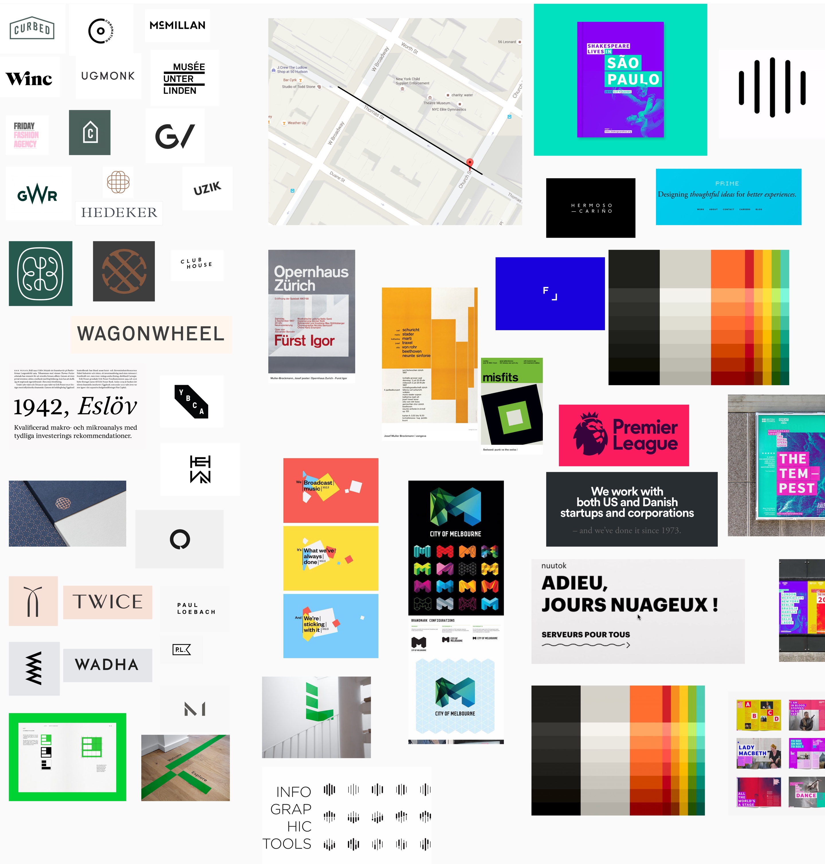
Research was done focusing on sites within the fashion and retail sectors as well as other digital agencies. We categorised the moodboards along a broad spectrum, white and minimal on the left, bright and colourful on the right.


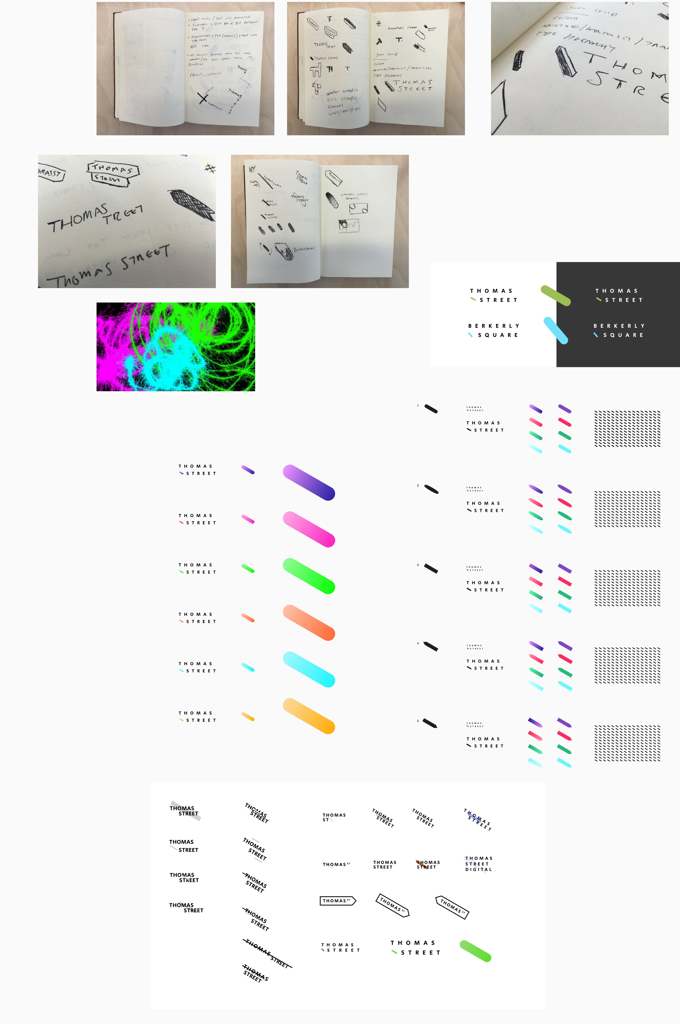
At numerous points in the brief it was mentioned that Thomas Street Digital was very proud of it's heritage - both as part of Gap Inc and also part of New York, naming themselves after the street both Gap Inc and themselves were based on. For this reason the logo developed was both simple and elegant but harked back to the heritage of the brand by being based on the 32 degree angle of the street as viewed from above.


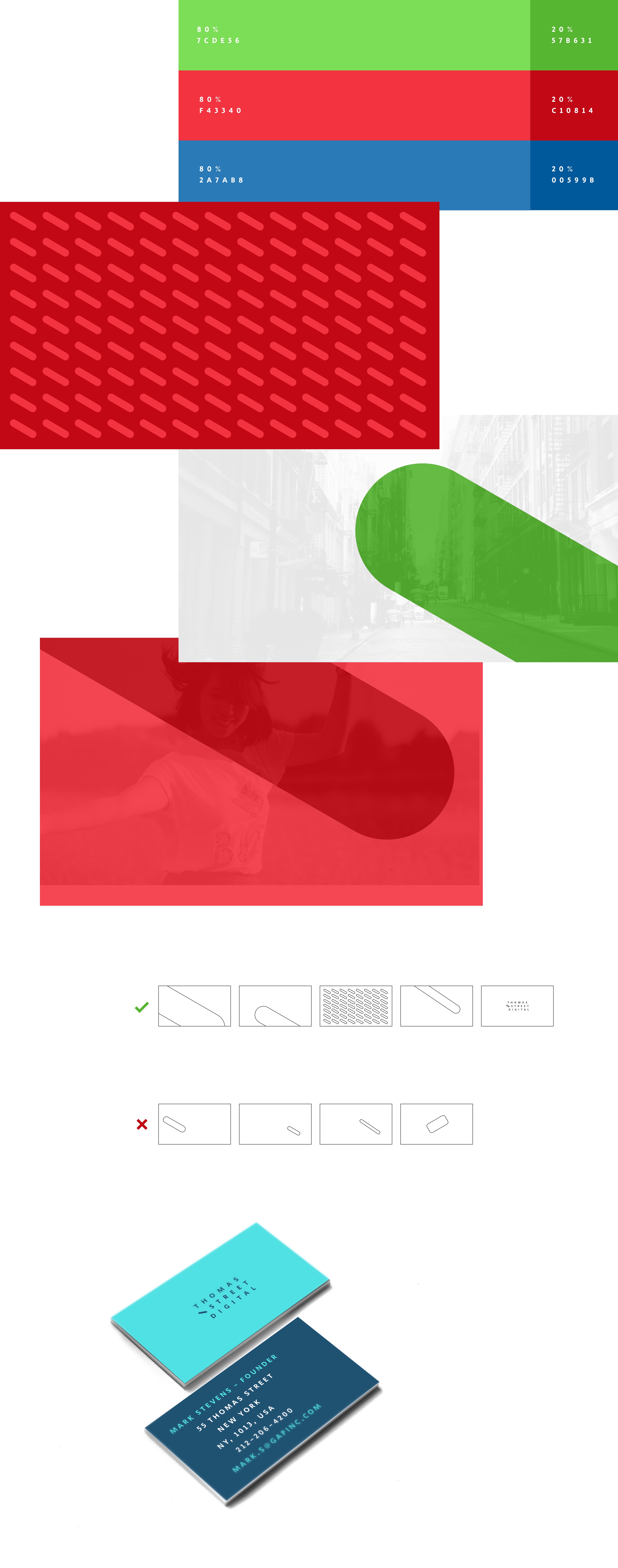
A brighter, more vibrant, blue was chosen for the primary (80% usage) brand colour with a secondary, darker, blue (20% usage) added which is similar to the original Gap Inc blue.
I also looked at how the brand language could be used across business cards and presentations ensuing that it wasn't too rigid for actual use.

