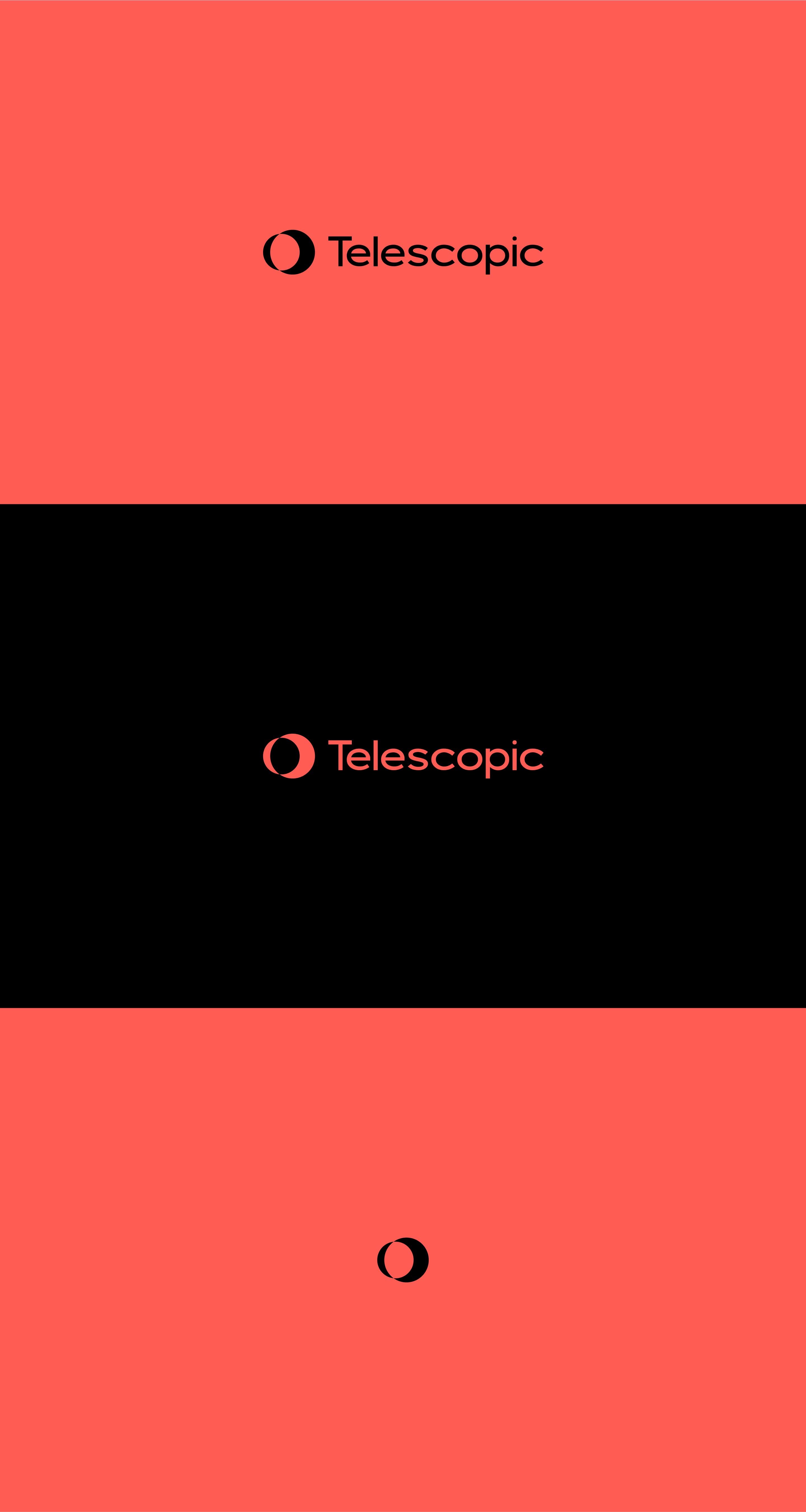
Telescopic
Branding and site design for a digital transformation agency.
Role
Branding, UX/UI
Year
2022
Branding, UX/UI
Year
2022
Agency
Direct
Client
Telescopic
Direct
Client
Telescopic

Since 2013 Telescopic has been making technology more accessible by providing personalised digital solutions for their clients. In 2022 they wanted to evolve their brand to better reflect this offering.
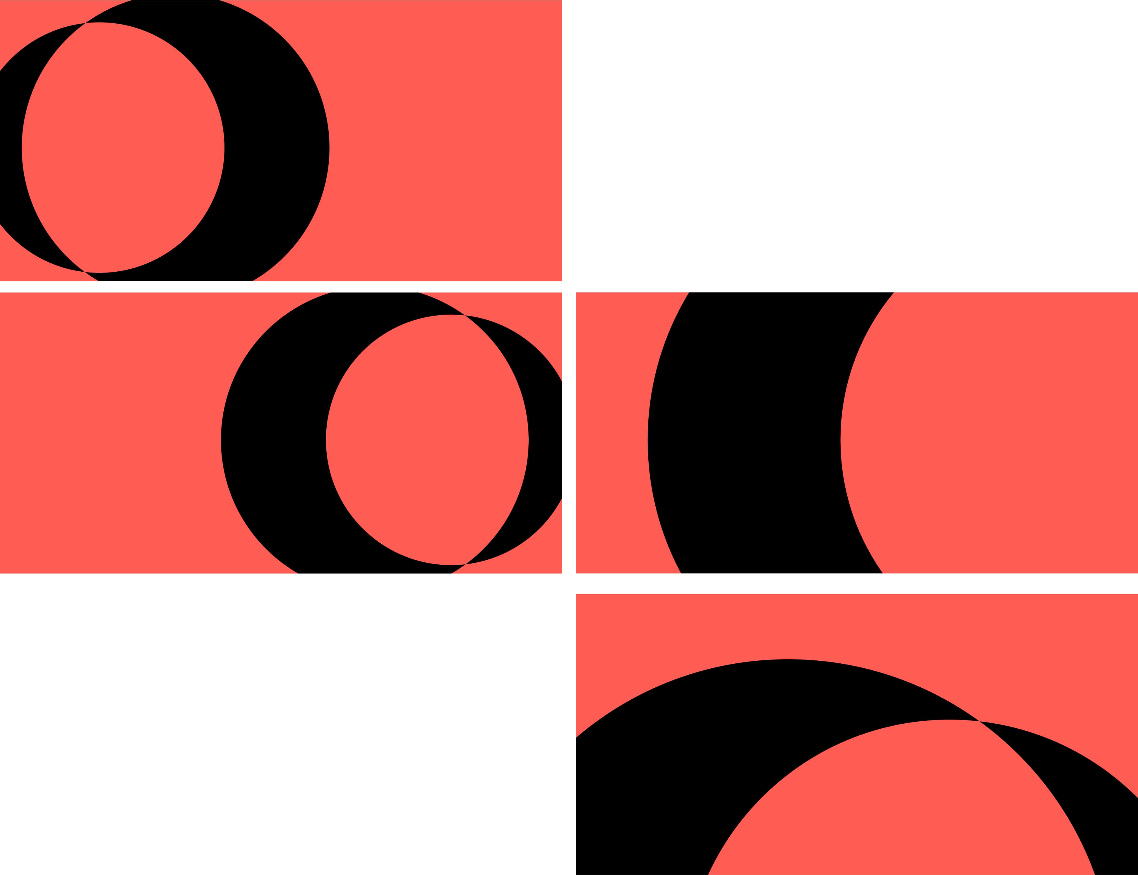
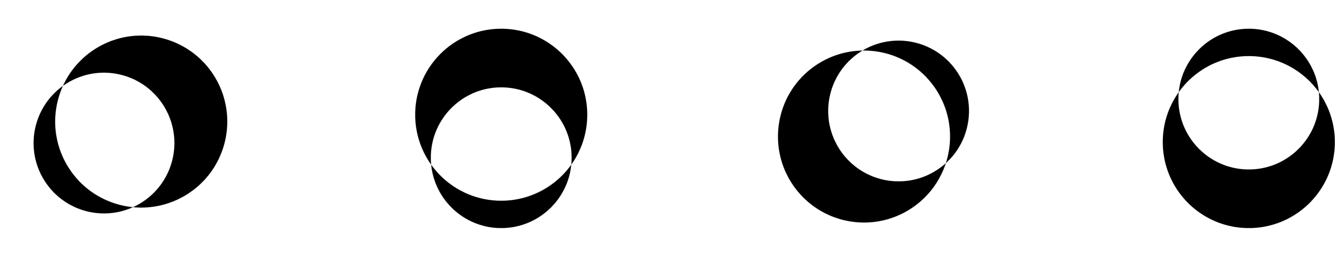
We started off with some research into minimal, mostly geometric, logos as Telescopic liked the simplicity of their current logo just not the shape or meaning behind it.

After this I sketched up some ideas thinking about what the mark should represent.
The meaning of Telescopic fitted in well with the new values of the company. The idea of looking at a client's problems, be it big or small, and being able to identify and focus on their needs.
Telescopic
1a: of, relating to, or performed with a telescope. b : suitable for seeing or magnifying distant objects. 2: seen or discoverable only by a telescope telescopic stars. 3: able to discern objects at a distance.
Key considerations for the logo was something that was both simple and minimal which could be animated in some way to get across the idea of focusing on a problem.

For the brand colours we looked at tweaking the existing blue to a darker, more midnight blue, but Telescopic felt that the brand should be friendlier and warmer (especially with the beautiful illustrations that were being worked on by Val Blondel).
In the end we settled on a bright coral that was a little more distinct and ownable in the technology space.